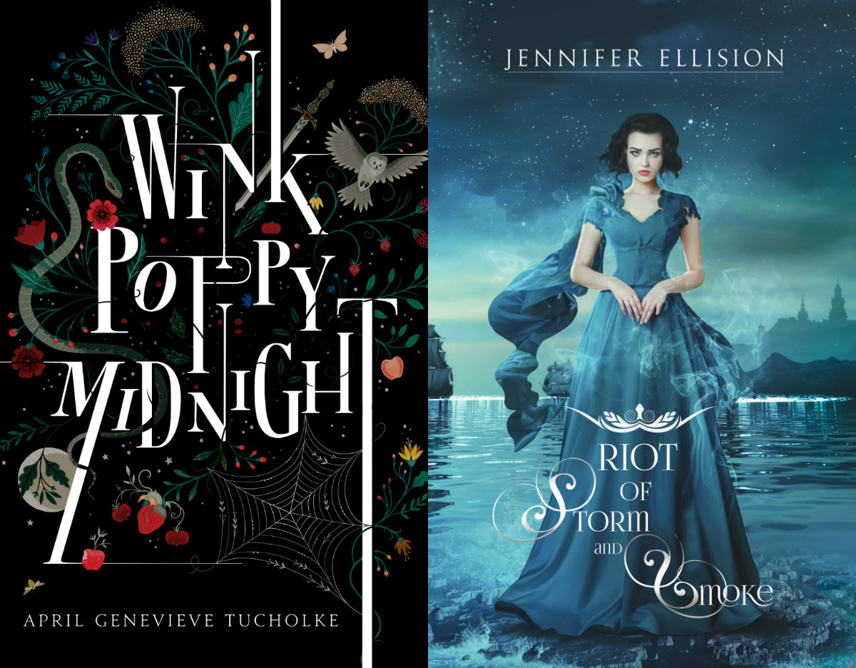
Song of Blood and Stone continues its fabulous run, destroying all other covers in its path. It's quite remarkable, but The Darkest Part of the Forest isn't shaking in its boots. These covers are ready to rummbllleee! (Sorry, it's late, I'm tired.)
The similarity has to be in the distinctive fonts. Song of Blood and Stone is elegant and sleek. The Darkest Part of the Forest has a classic vibe to it. The Darkest Part of the Forest draws attention to this font and the creepy herbs growing along with it, and that butterfly too. Song of Blood & Stone almost makes its font appear like it's glowing against the night sky, like some runaway wisps of the northern lights.
In any case, it's up to you to decide which cover shall win! You have one week to vote!


Song of Blood and Stone is really well done, but I am more drawn to The Darkest Part of the Forest - I think the typography is really well done.
ReplyDeleteYeah, I really like the use of white space. Thanks for voting!
Delete-P.E.